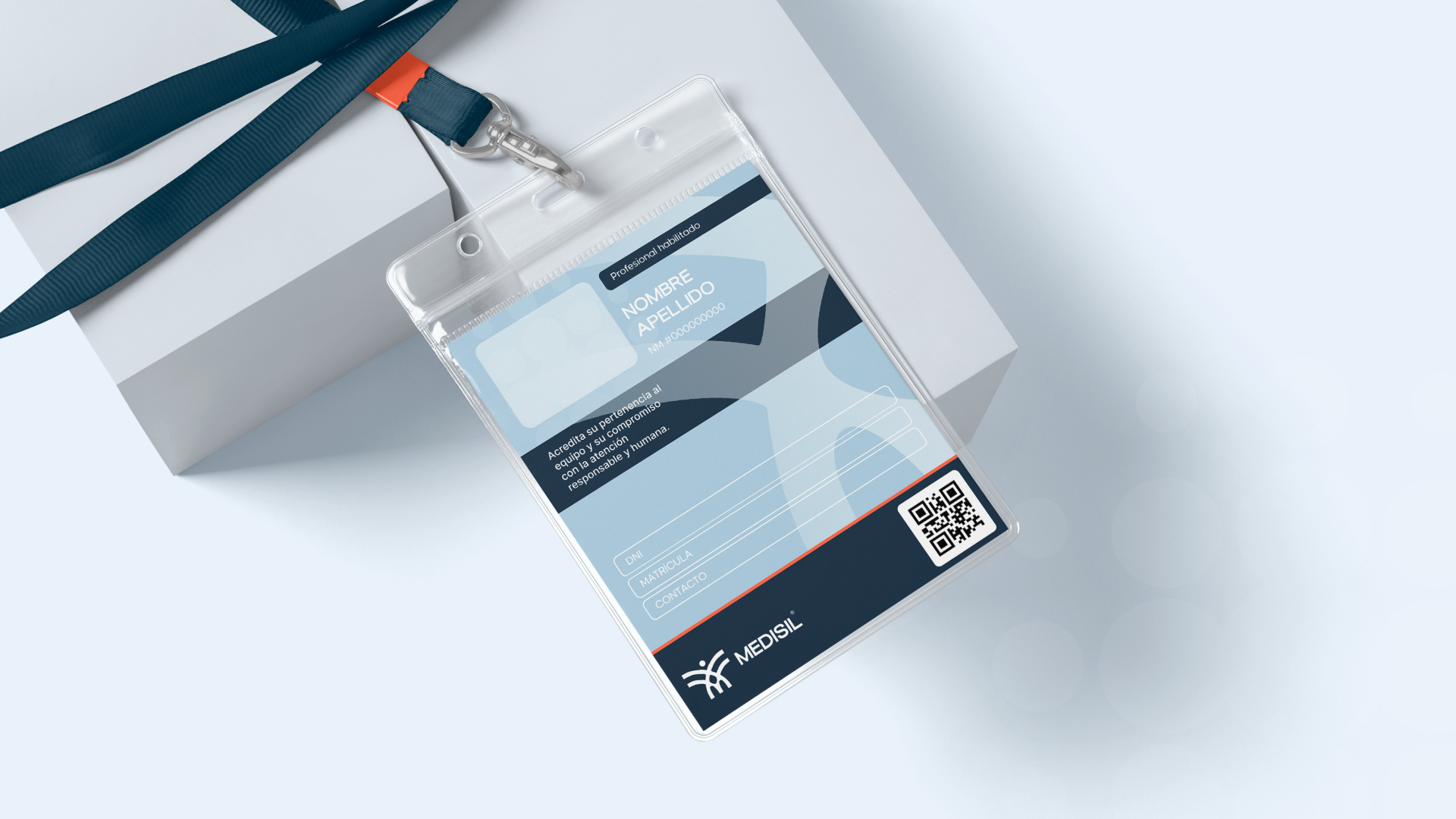
A strategic and visual identity built to professionalize a family-run home-care company with years of real healthcare experience, without losing the human quality that defines how they work.
Medisil is a family business with a solid track record in home-care services. Their team, formed by nurses, coordinators, and managers, needed to step up their brand presence to compete institutionally. The Argentine home-care market was saturated with generic aesthetics and impersonal messaging. The challenge was to build a professional identity that reflected what they were already doing in practice: caring with criteria, presence, and real commitment.
As Art Director at SODA Studio, I led the design work end-to-end while collaborating closely with the broader team on strategy and direction.
We defined the brand's strategic foundation together: purpose, values, vision, personality, tone of voice, and archetype. I owned the visual execution across every touchpoint.
The founding narrative was written from scratch, grounded in the team's real trajectory and experience rather than generic healthcare language.
I designed the full visual system: logo, color palette, and typographic hierarchy calibrated to feel professional without being cold or clinical.
The final deliverable was a complete Brand Manual covering principles, tone, color, typography, and real-world applications, built to guide the team's communication independently from that point forward.
Medisil consolidated its institutional identity with a consistent visual and verbal language.
The brand found a balance between professional structure and the warmth that comes from its family origins.
The Brand Manual became the reference for all communication and design decisions going forward.
The project established the foundation for digital expansion and stronger national presence.