BRANDING (end-to-end)

METRIKA

A full brand identity built from scratch for an organizational development consultancy with no prior digital presence. From competitive research to visual system, social media, and original content production.

Year
2025
Industry
Organizational Development & Coaching
Completion time
8 weeks
Client
METRIKA
ROL
Creative Director and Brand Strategist
No items found.

The challenge

METRIKA started as a blank slate. Two professionals with solid backgrounds in law and healthcare who wanted to build their own consulting practice, but with no brand, no digital presence, and very limited familiarity with what that process actually involves. Part of the work was building the identity. The other part was building a shared understanding of what branding, communication, and digital presence mean in practice, and why each decision matters. That layer of the project required as much attention as the creative work itself. The organizational coaching market adds another layer of difficulty. It is saturated with generic aesthetics, hollow language, and consultancies that either feel too corporate or too soft. Finding a real, defensible position in that space, one grounded in the founders actual experience and credentials, was the core challenge from the start.

The Solution

At SODA Studio, the goal is always the same: give brands that do not yet exist in the digital world a real identity and presence to stand on. Every project starts with research. We mapped the competitive landscape, identified where the white space was, and confirmed what made METRIKA's position viable. Almost no one in the space was combining genuine professional rigor with human presence, and the founders had the credentials to hold that territory authentically.

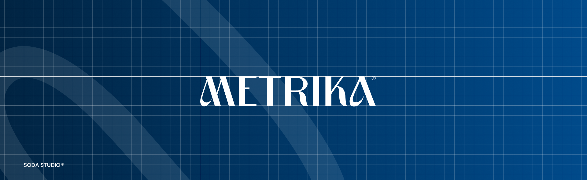
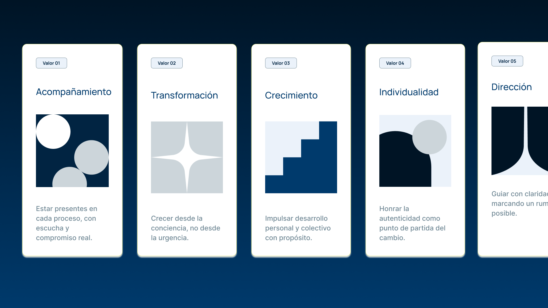
From that foundation, we defined the full strategic layer of the brand: purpose, vision, territory, tone of voice, and narrative. The name turned out to be a precise statement on its own. METRI for method and structure, KA for Karina and Ana. The story did not need to be invented. It needed to be found and articulated clearly.

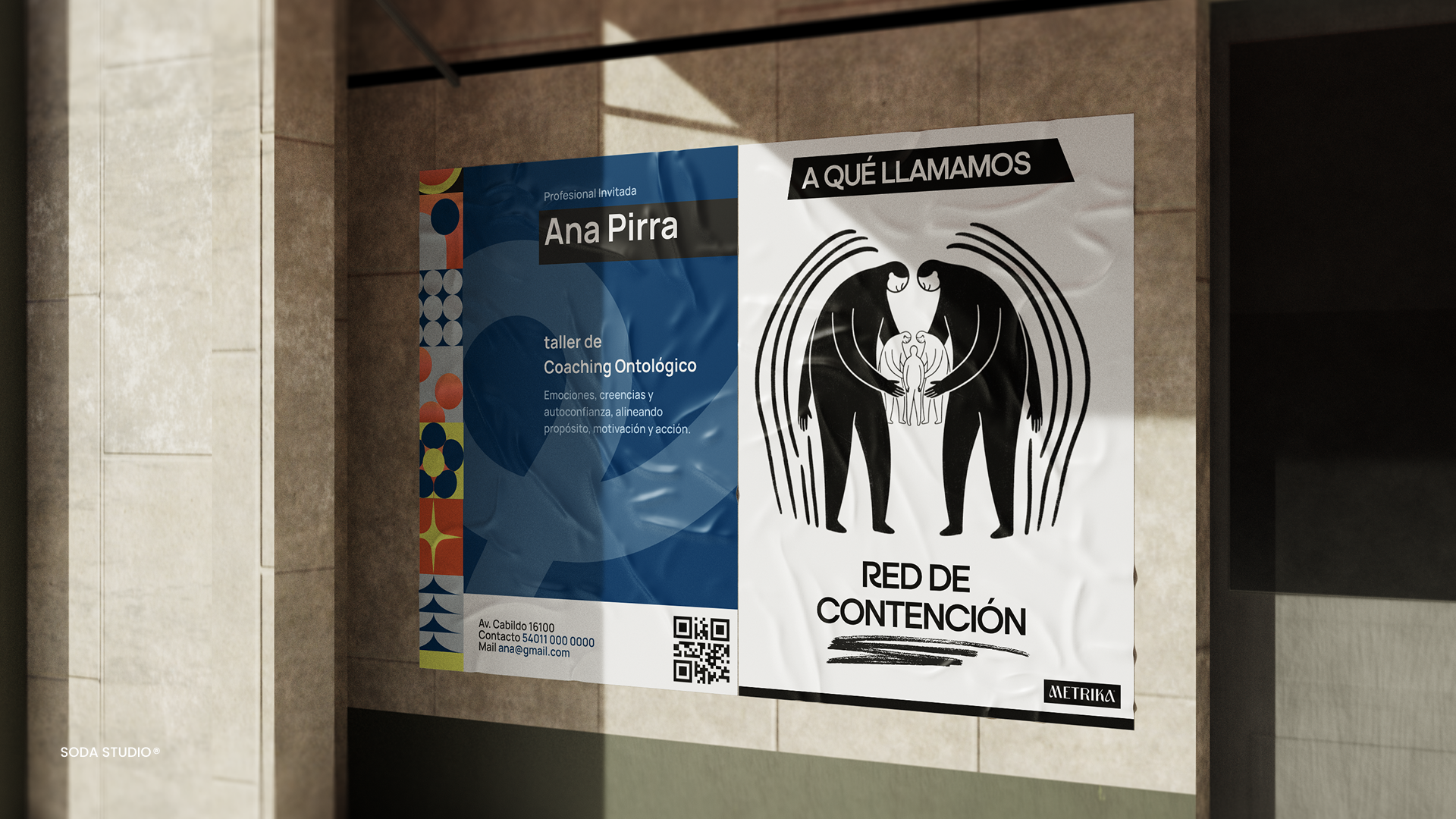
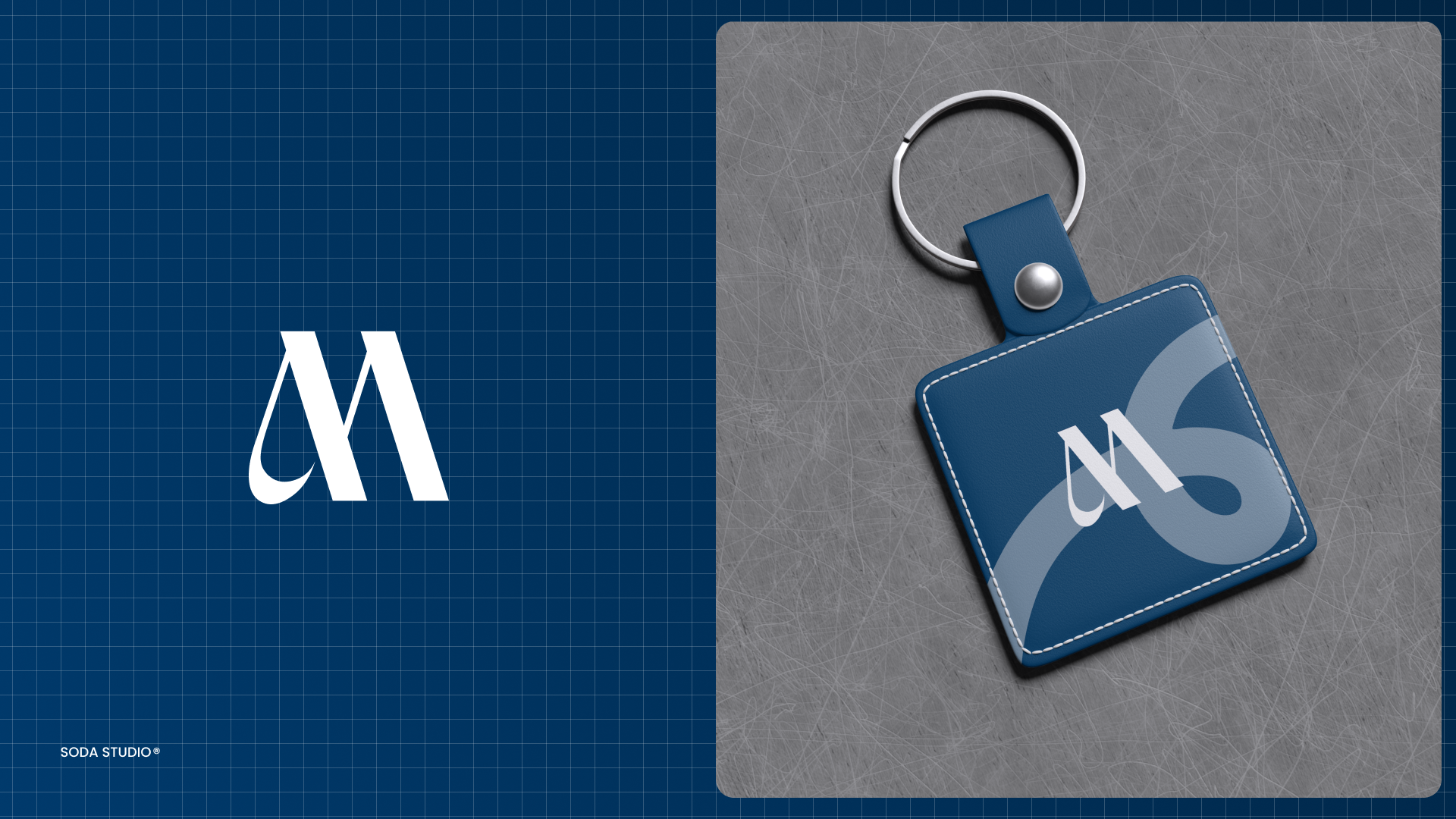
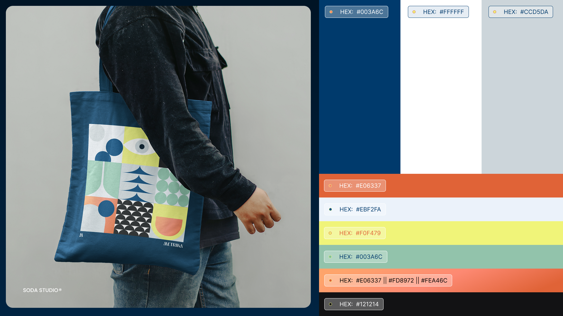
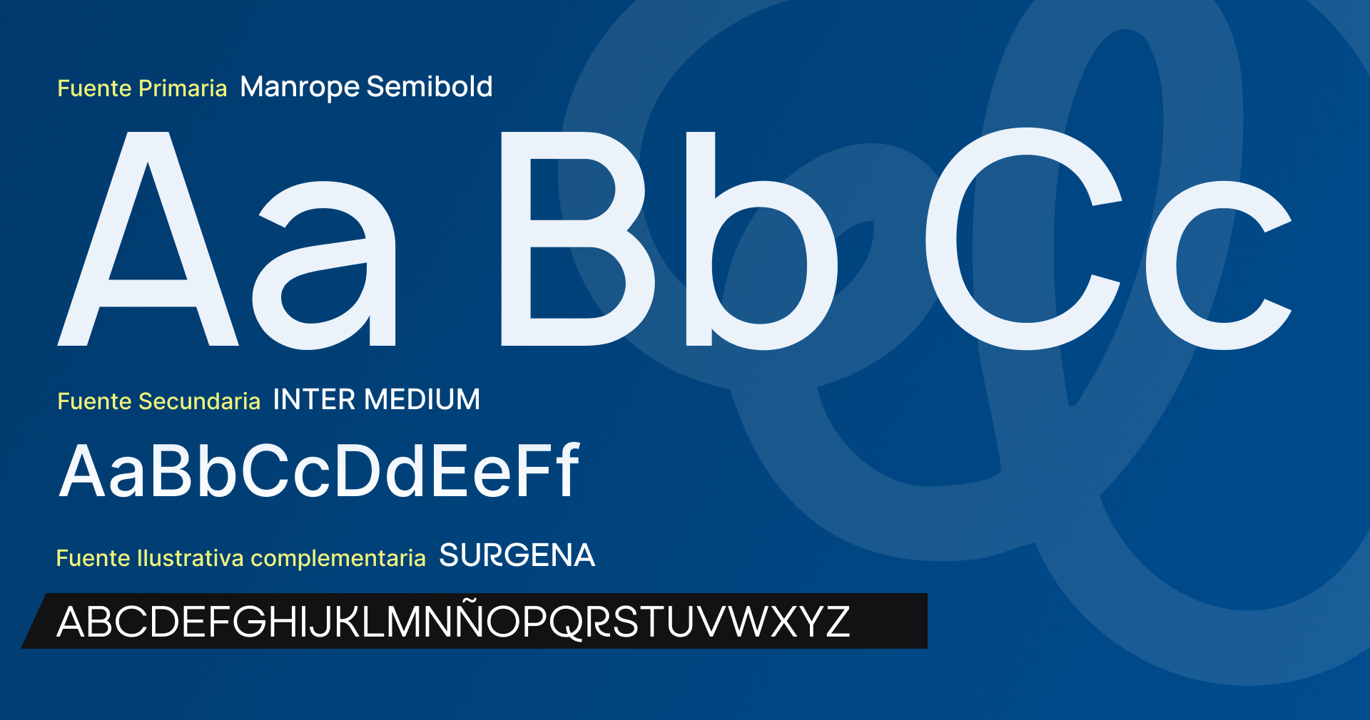
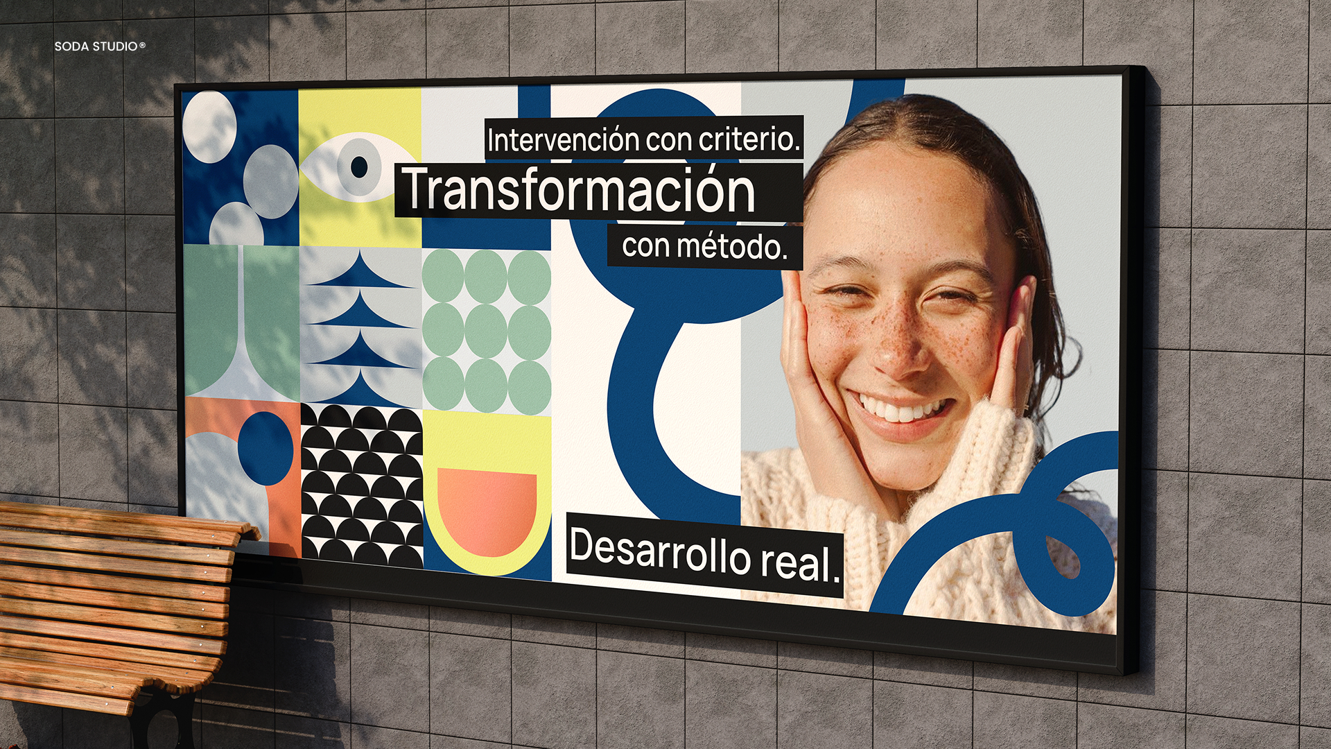
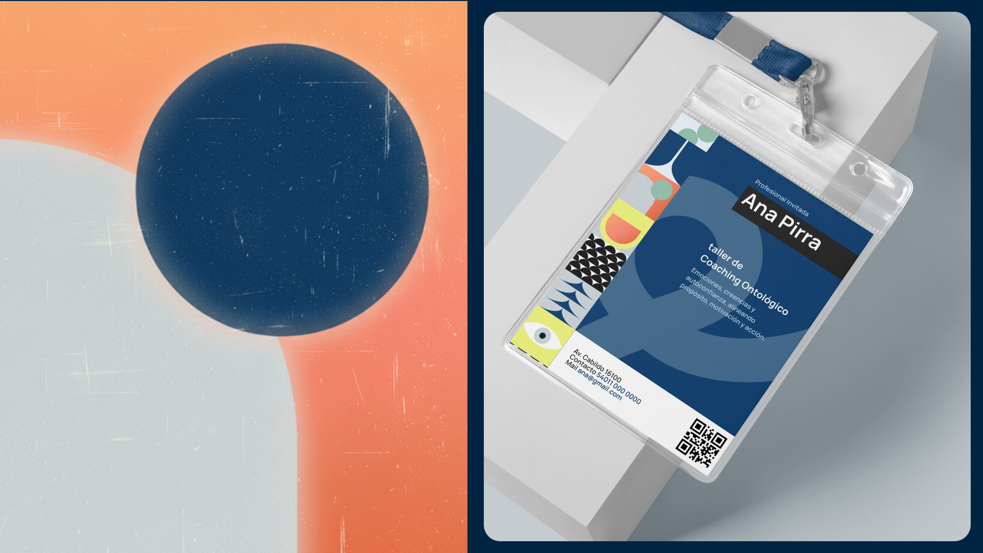
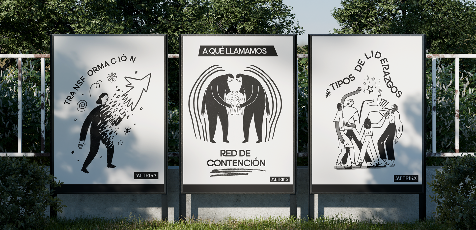
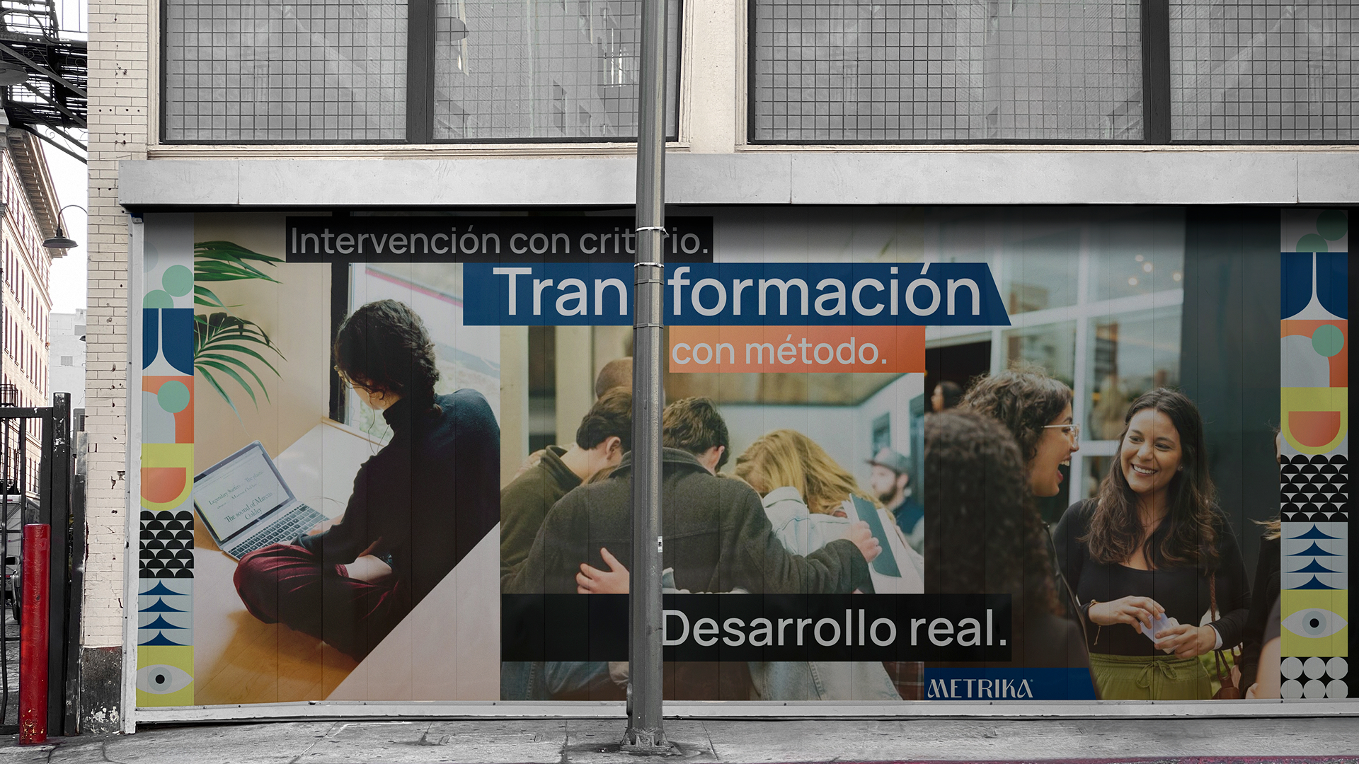
We then built the complete visual identity system: logo, variations, color palette, typographic hierarchy, usage guidelines, and editable files. The direction aimed for a solid, character-driven aesthetic that could hold up in B2B environments without feeling cold or generic.

The project closed with the social media setup across LinkedIn and Instagram: profile configuration, copy, branded templates, a content calendar, and an initial content batch produced with original photography and illustration developed in-house by our team.

The result

A brand built from zero and deployed across every touchpoint, for a team that started the process with no digital footprint and finished with a coherent, professional identity ready to grow.

The strategic foundation gave METRIKA a clear and differentiated language to communicate their work without relying on coaching cliches or vague positioning.

The visual system established a distinct presence in a market where most competitors blend together.

Social channels launched with original content, branded templates, and a calendar in place from day one.

The full scope of the project goes beyond what is shown here. If you want to see the complete process in depth, get in touch.

Related works

WhatsApp logo featuring a white telephone icon inside a green speech bubble.
Pssst! Let's Talk!